Color is one of the most powerful tools in event design. A well-chosen palette ties every element together — from the linens and florals to the signage and dessert table — creating that polished, cohesive look that makes guests walk in and immediately feel the magic. But with endless color combinations to choose from, landing on the right palette can feel overwhelming.
Whether you’re planning a bridal shower, baby shower, birthday party, or any custom celebration, this guide will walk you through everything you need to know about choosing an event color palette that feels intentional, beautiful, and completely you.
Start with a Single Source of Inspiration
The biggest mistake people make is trying to pick colors in a vacuum. Instead of scrolling through endless swatches, start with something tangible — a single item that sparks joy and sets the tone for your entire event.
Your inspiration source could be almost anything:
- A fabric or pattern — A floral napkin, a piece of wallpaper, or even a favorite dress can contain the perfect combination of hues already working in harmony.
- A flower — Garden roses, peonies, and ranunculus naturally blend multiple tones that translate beautifully into a full palette.
- Your venue — The architecture, wall color, and existing furnishings should complement your palette, not compete with it.
- A season — Spring pastels, summer brights, autumn jewel tones, and winter metallics all carry a built-in mood.
- A feeling — Words like “romantic,” “garden party,” or “modern elegance” naturally suggest certain color families.
Once you have your anchor piece, pull three to five colors from it. That’s your starting point.
Building Your Palette: The 3-Color Rule
Every strong event color palette breaks down into three roles: a primary color, a secondary color, and an accent. This framework keeps your design grounded while still allowing for visual interest.
- Primary color (60%) — This is the dominant color that appears most often. It sets the overall mood and typically shows up in your linens, large backdrop elements, and major decor pieces.
- Secondary color (30%) — This complements your primary and adds depth. You’ll see it in florals, smaller decor items, napkins, and signage backgrounds.
- Accent color (10%) — A pop of contrast that draws the eye. Think candle holders, ribbon details, place card lettering, or a single standout floral variety.
Don’t forget about neutrals. White, ivory, cream, soft gray, or black act as the “breathing room” in your design. They aren’t technically part of your three-color palette, but they’re essential for balance. A palette without neutrals can feel visually exhausting.
Popular Color Palettes for Showers and Parties
Need a jumping-off point? Here are some of the most requested palettes we work with — and why they work so well:
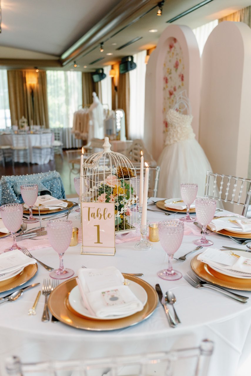
Blush, Cream, and Gold
A timeless choice for bridal showers and milestone celebrations. Blush brings warmth, cream keeps it soft, and gold accents add just enough glamour without tipping into overdone. This palette photographs beautifully and works in virtually any venue.
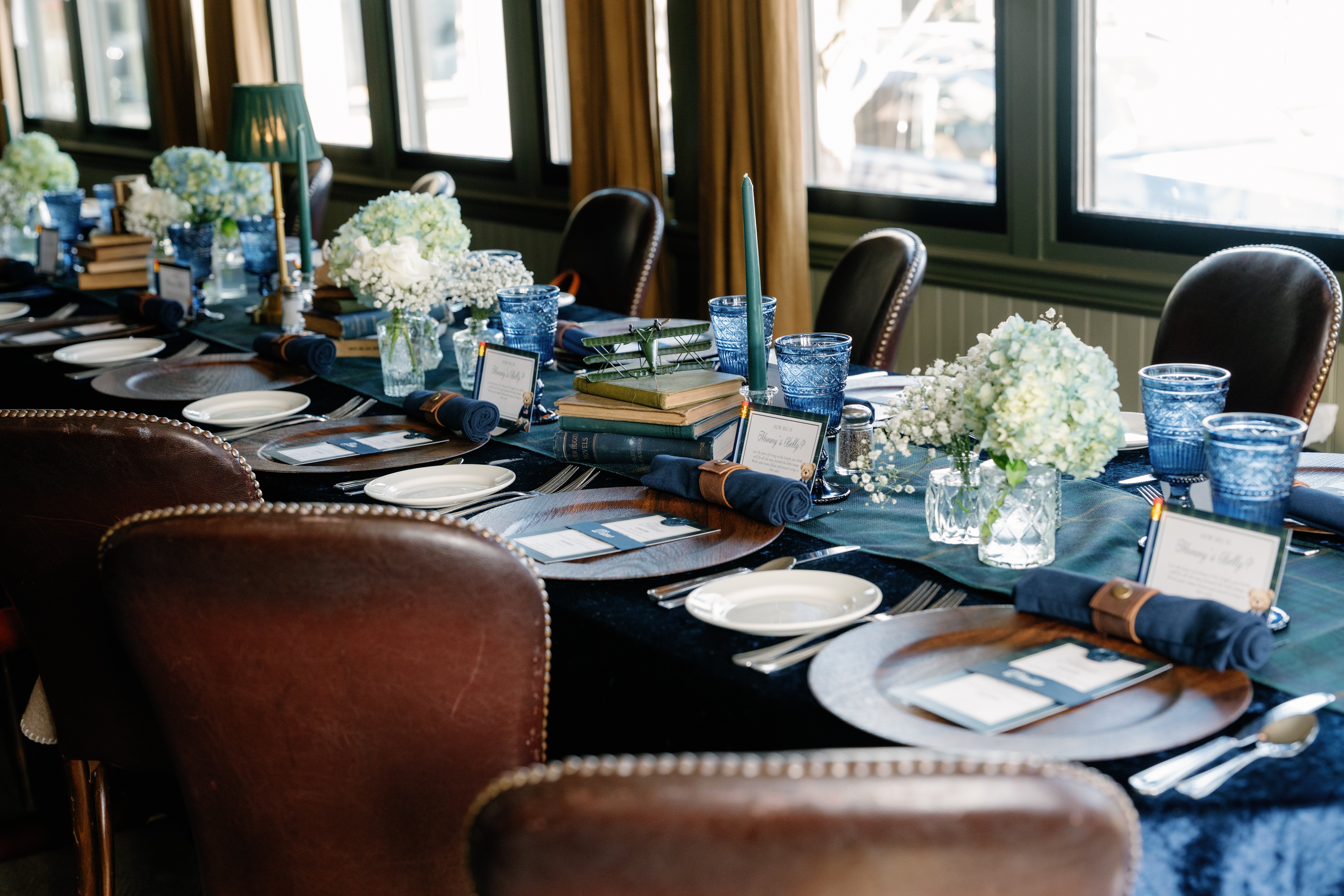
Navy, Sage, and White
Sophisticated with a natural feel. Navy grounds the design, sage adds an organic element, and white keeps everything fresh. This is a wonderful choice for garden-party-style showers or fall celebrations.
Terracotta, Dusty Rose, and Ivory
Warm, earthy, and undeniably modern. This palette has surged in popularity because it feels both on-trend and timeless. It works especially well with dried florals, linen textures, and wooden accents.
Lavender, Soft Green, and Cream
Perfect for spring baby showers or garden-themed parties. The combination feels fresh and whimsical without being overly sweet. Add touches of gold for a more polished look, or lean into natural greenery for a relaxed vibe.
Classic Neutrals with a Metallic
White, ivory, and taupe paired with either gold or silver creates a palette that’s elegant and endlessly versatile. This is a great choice if you love clean, minimal design or if your venue already has a lot of visual character.
Applying Your Palette Across Every Detail
Choosing your colors is only half the work. The real magic happens when you carry that palette consistently through every element of your event.
- Linens and tableware — Tablecloths, napkins, charger plates, and glassware are your largest canvas. Anchor your primary color here.
- Florals and greenery — Flowers are where your secondary and accent colors shine. Ask your florist (or, if you’re going handmade, plan your arrangements) to incorporate tones that directly reference your palette.
- Signage and stationery — Welcome signs, menus, place cards, and table numbers should echo your palette. Even the ink color and paper stock matter.
- Dessert table — Coordinate your cake, cookies, macarons, and candy to match. A styled dessert display is often the centerpiece of any shower or party.
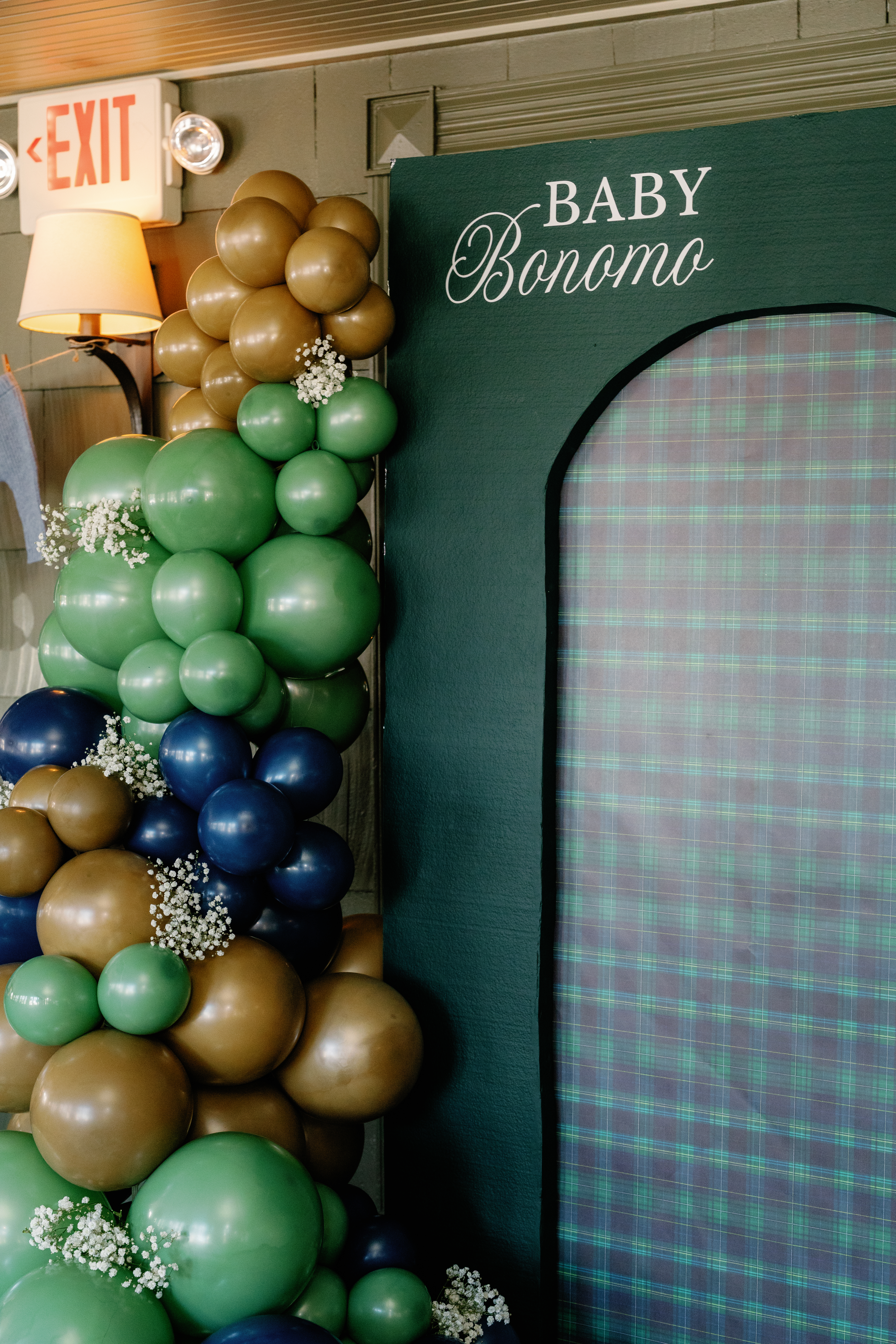
- Backdrops and installations — Balloon arches, floral walls, and draped fabric all present opportunities to reinforce your color story in a big, impactful way.
- Small details — Ribbon on favors, the color of your candles, the foil on your invitations — these seemingly minor touches are what elevate a color palette from “coordinated” to “curated.”
Common Color Palette Mistakes to Avoid
After designing hundreds of events, we’ve seen a few patterns that tend to trip people up:
- Too many colors — More than three or four intentional colors (plus neutrals) starts to feel chaotic. Edit ruthlessly. If you love five colors, ask yourself which three you truly can’t live without.
- Ignoring undertones — A cool-toned pink and a warm-toned pink may both be “pink,” but they’ll clash. Pay attention to whether your colors lean warm or cool, and keep them in the same family.
- Matching everything exactly — A palette should be cohesive, not identical across every surface. Slight variations in shade and texture create visual richness. A blush tablecloth, a mauve napkin, and a dusty rose ribbon are all “pink” — and they look far more interesting together than three identical pinks.
- Forgetting about lighting — Colors look different under natural light, warm Edison bulbs, and harsh fluorescents. If possible, test your color samples in the actual lighting conditions of your venue.
- Neglecting contrast — An all-pastel palette is beautiful, but without a darker anchor or a metallic accent, it can wash out. Make sure your palette has enough range to create visual hierarchy.
Bringing It All Together
The best color palettes feel effortless, even though they’re the result of careful, intentional decision-making. Start with a single source of inspiration, build your palette around three core colors, and then carry those colors through every touchpoint — from the largest backdrop down to the smallest ribbon.
If you’re feeling stuck or want a professional eye on your vision, we’d love to help. Color palette design is one of our favorite parts of the planning process, and we work with every client to develop a scheme that feels personal, polished, and perfectly suited to the celebration. Reach out to our team and let’s start building something beautiful together.